.jpeg)
Creating a personal connection between data and user with conditional narrative in Tableau
Last month’s Seattle Tableau User Group meeting featured a hands-on redesign session based on Makeover Monday. (Special thanks to Gina Bremer for organizing this and pushing a number of us to try it for the first time.) Below is my entry and some notes about my approach.
For those who don’t know, Makeover Monday is a weekly data viz challenge hosted by Eva Murray and Andy Kriebel. They post a “before” viz and its underlying data every Monday, invite the worldwide data viz community to take a stab at improving it, and then host a webinar the following Wednesday to review submissions and provide feedback. So it is an intense quick-turn sprint, sure to push the limits of even seasoned professionals.
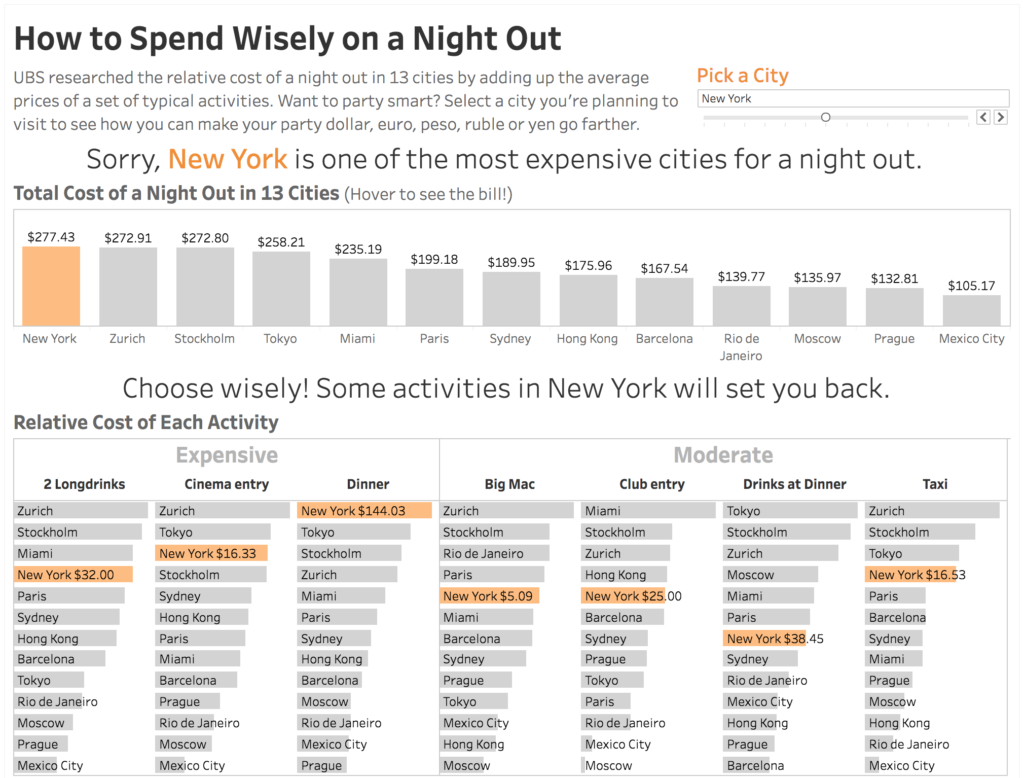
For our SeaTUG session, Gina picked a fun topic from last year: a comparison of the cost of a night out in 13 major cities, based on average prices of seven common activities. Here’s the “before” viz:
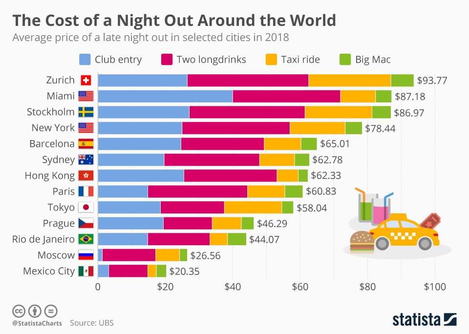
Overall, a fairly simple, attractive and understandable viz, but with plenty of room for improvement. My main criticism was that while it lets you easily compare the overall costs of each city, you can’t easily compare the costs of the individual activities, except for the “Club entry” bars aligned with the baseline. This is a common shortcoming of stacked bar charts.
Here’s my redesign (animated to show the interactivity):
My main focus was increasing user engagement with the viz by personalizing it. Rather than just dispassionately comparing data across cities (or pretending that most people can actually jet off to any of them at will), I prompt the user to select a city they plan to visit, then give them some practical advice on what activities they can choose to get the most value for their money relative to other cities. The idea is to engage the user in the viz not just by making it visually interesting but, as Steve Wexler says, creating a personal connection between the data and the user.
Presenting a selector and highlighting the selected city was easy, but dispensing advice with conditional narrative text was more challenging. Here’s how I did it:
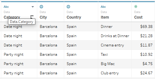
The source data consists of a simple table of cities, activities (called “item”) and costs. The items were further categorized as “Date night” or “Party night,” though I didn’t use that in my viz.
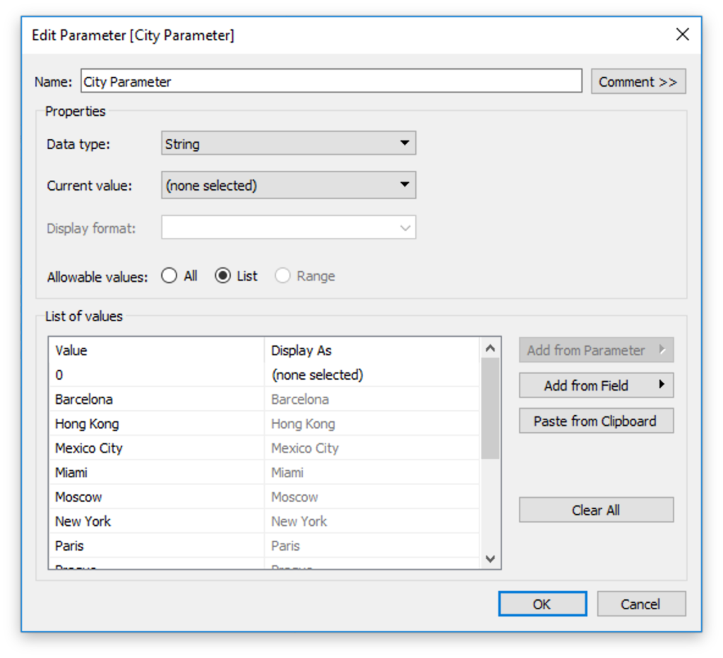
The first step was to create a parameter from the City field to use as a selector menu:
Then I used a simple Boolean calculation to check if each row of data pertains to the selected city:
// [City is Selected?]
[City] = [City Parameter]
Then I started experimenting with charts and calculations to compare the selected city’s costs with other cities. Initially I focused on comparing each city’s ranking (both overall and per activity). Tableau makes this very easy using table calculations, but in order to use these rankings to power my conditional narrative, I needed to work with rankings outside of the visible dimensions — i.e. using LOD expressions. That’s when I realized that ranking is not well supported in Tableau outside of table calculations. So, after upvoting this Tableau feature idea, I switched to a different way of comparing relative prices: percent of maximum:
//[Selected City is Expensive?]
SUM( IF [City is Selected?] THEN [Cost] END )
/
MAX( { FIXED [City] : SUM([Cost]) } )
> [Expensive Threshold]
//[Selected City is Cheap?]
SUM( IF [City is Selected?] THEN [Cost] END )
/
MAX( { FIXED [City] : SUM([Cost]) } )
< [Cheap Threshold]
The numerator uses an IF THEN expression to select only the selected city’s costs before summing them. The denominator uses a FIXED LOD expression to sum the costs of each city before calculating the MAX. The resulting fractions are then compared with parameters containing the threshold that I consider “expensive” or “cheap.” Using parameters instead of hard-coding these values let me play with different thresholds and see how the viz reacted.
Once I had a metric that worked well with LOD calculations, I could start writing conditional expressions to display different narratives — e.g. “Congrats, Prague is one of the least expensive cities for a night out.” I split this into three separate calculations so that I could apply different text formatting to each:
// [Narrative 1]
IF [City Parameter] != '0' THEN
    IF [Selected City is Expensive?] THEN 'Sorry,'
    ELSEIF [Selected City is Cheap?] THEN 'Congrats,'
    ELSE ''
    END
END
// [Narrative 2]
IF [City Parameter] != '0' THEN
    ATTR([Selected City])
END
// [Narrative 3]
IF [City Parameter] != '0' THEN
    IF [Selected City is Expensive?] THEN 'is one of the most expensive cities for a night out.'
    ELSEIF [Selected City is Cheap?] THEN 'is one of the least expensive cities for a night out.'
    ELSE 'is neither the most nor least expensive city for a night out.'
    END
END
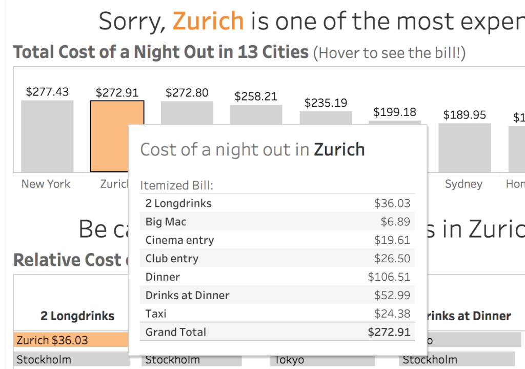
I displayed this narrative text above a basic bar chart that showed how the selected city ranked on overall cost, with a tool tip that shows an itemized bill:
Then I turned to creating narrative text based on individual activities. This proved to be trickier because I wanted to express nuances such as “Overall this is one of the most expensive cities, but some activities are relative bargains.” I decided to base this on categorizing each activity as relatively expensive or cheap compared with other cities, then counting them. My first attempts at this kept producing continuous measures rather than a dimension that I could list and count, until I found this knowledge base article: Unable to Convert Measure to Dimension. The key was that although the calculation needs to perform an aggregation to get the MAX activity cost across cities, the end result of the calculation must not return an aggregation. So I created Boolean calculations to check if the activity’s cost is above or below the threshold for the selected city:
// [Activity is Relatively Expensive?]
[Cost] / {FIXED [Item] : MAX([Cost])} > [Expensive Threshold]
// [Activity is Relatively Cheap?]
[Cost] / {FIXED [Item] : MAX([Cost])} < [Cheap Threshold]
Then used an IF THEN expression to return [Item] only if it is above or below the threshold for the selected city:
// [Selected City Expensive Activities]
IF [City is Selected?] AND [Activity is Relatively Expensive?]
THEN [Item]
END
// [Selected City Cheap Activities]
IF [City is Selected?] AND [Activity is Relatively Cheap?]
THEN [Item]
END
Then used a bunch of conditional expressions with COUNTD of these dimensions to output conditional narrative text:
// [Narrative (activities)]
IF COUNTD([Selected City Expensive Activities]) > 0 AND COUNTD([Selected City Cheap Activities]) > 0
THEN 'A mixed bag! Some activities are pricey while others are on the cheap side.'
ELSEIF COUNTD([Selected City Expensive Activities]) = 7
THEN 'Brace yourself! All activities in ' + ATTR([Selected City]) + ' are among the most expensive.'
(etc...)
END
In addition to this narrative text, I wanted a bar chart that shows not only how each city ranks within each activity, but also groups the activities as Expensive, Moderate and Cheap. So I created a calculation that returns this string for each city and activity:
// [Activity Relative Cost Category]
IF [Activity is Relatively Expensive?] THEN 'Expensive'
ELSEIF [Activity is Relatively Cheap?] THEN 'Cheap'
ELSE 'Moderate'
END
Then created a dimension to use on my Columns shelf only if a city is currently selected:
// [Selected City Activity Relative Cost Category]
IF [City Parameter] != '0' THEN
{ FIXED [Item] : MAX( IF [City is Selected?] THEN [Activity Relative Cost Category] END ) }
ELSE ''
END
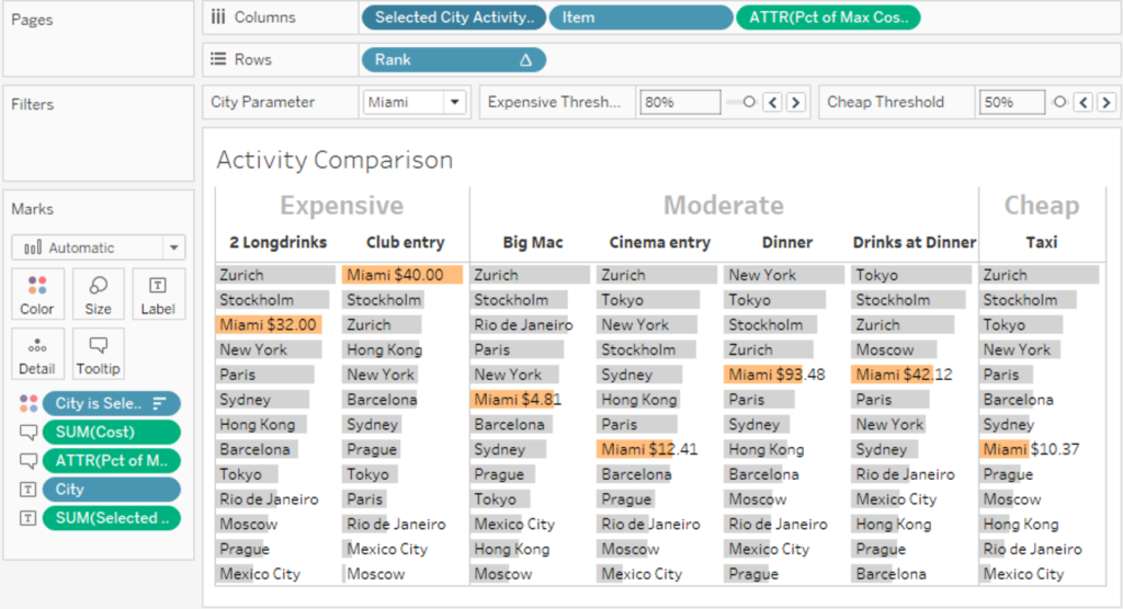
The chart’s columns are sorted by this dimension, so they rearrange themselves when the selected city is changed!
Finally, I’m a big believer in using color very intentionally. I used the practice of first designing the viz with no color at all, then adding color for emphasis. So the initial viz is entirely gray, except for the bright orange “Pick a city” prompt. Once you select a city, that color is used to highlight the data for this city throughout the viz.
Admittedly, with only 13 cities and 7 activities, it’s not hard to reach these same conclusions by just eyeballing the viz, without the fancy rules-based narrative. But this rules-based approach would scale up to work with a much larger dataset that you can’t easily eyeball.
Now that I got my feet wet with Makeover Monday, I plan to participate with new sessions more regularly. You can view and download my final viz on Tableau Public.